The Color of Goodbye: How Color Psychology Affects Memorial Atmosphere
Discover how color psychology shapes the tone of memorials. Learn what different hues symbolize and how they can bring comfort, peace, and meaning to a celebration of life.
Beyond Black: Rethinking the Colors of Mourning
For generations, black has been the color most associated with grief — solemn, respectful, and timeless.
But as memorials evolve into celebrations of life, color has taken on a new role: one of expression, healing, and tribute.
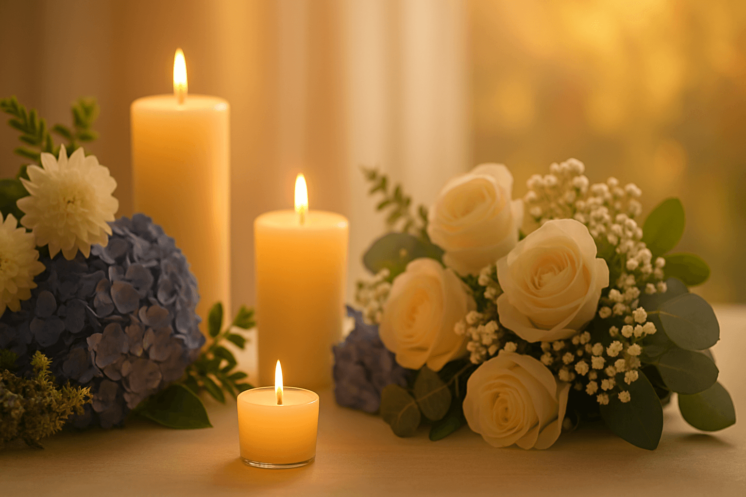
The colors we choose for flowers, décor, attire, and even lighting create atmosphere — they speak quietly to emotion.
Each hue carries its own vibration, shaping how we feel, remember, and connect.
The language of color, like love, transcends words.
The Calming Grace of Blue
Blue is the color of peace — soft skies, still waters, deep reflection.
In a memorial setting, it brings calm and comfort, encouraging quiet contemplation.
Lighter shades of blue suggest serenity and openness, while deeper tones evoke trust and faith.
Families often choose blue flowers or linens for outdoor or seaside ceremonies, symbolizing emotional depth and spiritual continuity.
Blue says: “You are remembered with peace.”
The Renewal of Green
Green represents renewal, growth, and connection to the natural world.
It’s the color of balance — between sorrow and healing, between goodbye and new beginnings.
In floral arrangements, greenery adds grounding energy. In outdoor memorials, the color blends seamlessly with life itself.
Green reminds us that even in loss, the world continues to grow — and so can we.
“To stand among trees or gardens in grief is to be reminded that love, like life, always finds a way to renew itself.”
The Warmth of Yellow and Gold
While yellow might once have seemed too bright for mourning, it has become a beloved color for celebration-of-life ceremonies.
It represents warmth, optimism, and gratitude — the joy of having loved deeply.
Touches of gold or amber can also symbolize light and eternity — a reminder that love continues to shine.
When paired with white or cream, these tones create a sense of reverent joy — honoring not just a life lost, but a life well lived.
The Purity and Light of White
White remains one of the most universal colors of remembrance.
Across cultures, it symbolizes peace, purity, and spiritual release.
It reflects light rather than absorbing it — a metaphor for transformation and transcendence.
In modern memorials, all-white themes feel airy and timeless, allowing simplicity and emotion to speak more loudly than decoration.
White says: “This is sacred. This is peace.”
The Comfort of Earth Tones
Soft browns, beiges, and taupes create warmth and grounding — ideal for smaller, more intimate services.
These tones evoke home, heritage, and the natural cycle of life.
Candles, wood, stone, and linen all embody the quiet beauty of earth tones — making spaces feel safe, lived-in, and deeply human.
In times of grief, comfort often begins with the familiar — and earth tones whisper that life endures in its quiet rhythms.
The Boldness of Red and Purple
Red has long symbolized passion and vitality. In remembrance, it can represent enduring love, courage, or a vibrant spirit that lives on.
Used sparingly — in roses, ribbons, or accents — it draws focus to the intensity of emotion without overpowering the moment.
Purple, meanwhile, carries a more spiritual tone. Associated with dignity, remembrance, and reverence, it bridges sorrow and transcendence.
Lavender variations soften its message, adding calm and healing to the mix.
Together, red and purple honor those whose presence was larger than life — the ones who lived with heart, color, and conviction.
Designing a Palette for Emotion
The beauty of modern memorials lies in personalization.
Families can design color palettes that reflect not just tradition, but personality — the soft pink of a gentle soul, the ocean blue of a sailor, the golden hues of a sun-lover.
Consider how different colors interact:
Blue and white evoke serenity and reflection.
Green and cream symbolize renewal and peace.
Lavender and silver suggest grace and quiet strength.
Yellow and white bring warmth and lighthearted remembrance.
The goal isn’t to decorate grief, but to illuminate love — visually, emotionally, spiritually.
Color as a Bridge Between Memory and Emotion
At Honoring Lifetimes, we often remind families that color is more than visual — it’s emotional language.
It helps the heart remember in shades of comfort and hope.
Whether through flowers, lighting, clothing, or candles, the hues that surround a memorial shape how we heal.
In every color of goodbye, there’s a hint of light that says, “This love remains.”
“Color doesn’t erase sorrow — it paints it with meaning.”
You might also like
From Funerals to Celebrations: The Shift Toward Positivity in Grieving
From Funerals to Celebrations: The Shift Toward Positivity in Grieving
The way we approac
Read More
Why More Families Are Choosing Celebrations of Life Over Traditional Funerals
Why More Families Are Choosing Celebrations of Life Over Traditional Funerals
In recent y
Read More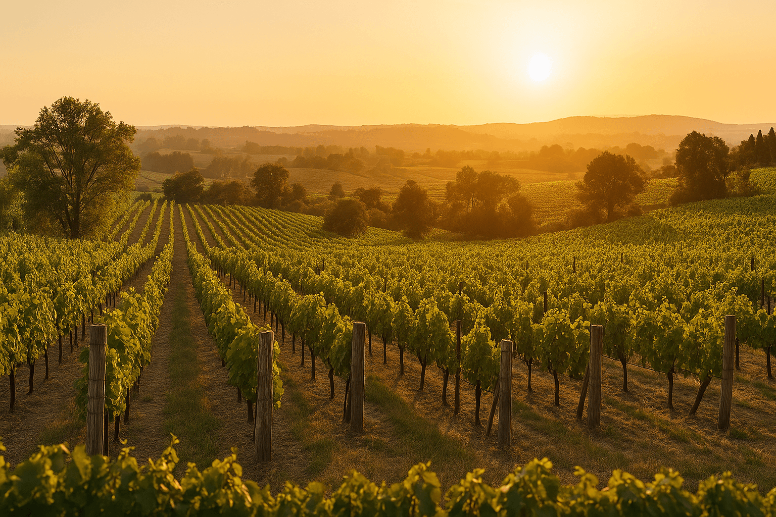
Celebrations of Life in Wine Country: Beauty, Meaning and Setting
Celebrations of Life in Wine Country: Beauty, Meaning and Setting
There are few places mo
Read More